Wichita State University's institutional logo unifies our colleges, departments, centers and organizations. Like its predecessors, the institutional logo incorporates wheat as a symbol representing our place and our history. Harking back to our earliest days when students shocked wheat as a means of financial support, the use of wheat within the logo continues to represent the hard work and commitment to quality that Wichita State is known for as Kansas' only urban-based research university.
Naming units for colleges, departments, centers and institutes
Naming units provide a way for organizations to have a greater sense of identity, increased recognition, and easier application on promotional items and other materials.
Wichita State institutional logo
WSU's institutional logo is trademark protected. By using any of the logos, you are agreeing to follow WSU's Visual Identity Standards and the university's policy governing rules of use. The WSU horizontal logo is the preferred form.
Downloads
WSU institutional logo How to set up naming units
Troubleshooting
Helpful tips for logo filesSignature elements
Wichita State University's institutional logo is the combination of three elements. The institutional logo is the physical combination of the Wichita State logo, the Wichita State University logotype and the dotted line that serves as the connecting unit between the two. They are placed in a specific scale and relationship to each other that prevents the independent altering of elements.
The primary institutional logo is horizontal in orientation. This is the preferred configuration. There is a centered vertical configuration of the institutional logo that should be used only when limited space requires it.
![]()
Wichita State logo
This three-letter acronym is the abbreviation adopted generations ago for Wichita State University. It is crowned by a stalk of wheat, which refers to the university's heritage as Wheatshockers and to WuShock, the university's mascot. Origins of this association date back more than a century to a time when students took on summer jobs harvesting and stacking shocks of wheat in the fields surrounding the campus. Crafted in the school's traditional colors of black with an outline of yellow, the logo embodies the bold forward motion of Wichita State.
Divider bar
This graphic device serves both to visually separate and create linkage between the logo and the logotype.
Wichita State University logotype
The name of the university is designed to project a contemporary forward-thinking appearance while at the same time maintaining a classical aesthetic. Because it is a modified variation on the font Klavika, it cannot be reproduced by simply resetting. Always use the complete institutional logo in digital form as provided by the university.
How to use our logo
Horizontal logo
The preferred use whenever possible is the Wichita State institutional horizontal logo. The individual parts of the institutional logo should not be separated, and the typography should not be reset, as it was customized for this logotype. Never try to approximate or re-create these designs. Adherence to first-generation art assures consistency and ensures the long-term success of the institutional logo.
![]()
Vertical logo
Use the preferred, horizontal logo whenever possible. When space is limited or if other layout variants create challenges for the horizontal logo, the vertical version of the institutional logo may be used. As with the institutional logo, the individual parts of the logo should not be separated, and the typography should not be reset.
![]()
Clear space
Clear space must be provided between the institutional logo and other graphic elements. The clear space requirements delineated here must be observed except in rare, pre-approved exceptions. These are the minimum requirements.
Give the institutional logo room to stand out by allowing a clear space around it. The clear space should be equal to one half of the institutional logo height.

![]()
Minimum institutional logo sizes
Print logo minimum size
The minimum size of the Wichita State institutional logo should not be less than 1/4 inch in height for print usage. This measurement is taken from the top edge of the separator dot to the bottom edge of the "S" in the logo.
![]()
Web logo minimum size
For web use, the minimum size of the Wichita State institutional logo should not be less than 90 pixels in height (with clear space requirement included).
![]()
Color consistency is a very important aspect of maintaining a strong identity for Wichita State. Color consistency will help to build recognition of the Wichita State institutional logo as well as convey a sense of organization, unity and professionalism.
Wichita State University primary colors
Wichita State's official colors are Shocker Yellow™and Black. These two colors are also reflected in the institutional logo and spirit marks.
Two-color Wichita State institutional logo
The preferred institutional logo version is the two-color version. This gives another opportunity for use of the school colors and allows reinforcement of the institutional logo in its most pure form. The institutional logo should be used when possible on a white or very light background color. When other background colors must be used, please refer to the color background guidelines in the below section, "Use of Wichita State institutional logo on colored backgrounds."
![]()
Clarification on Shocker Yellow™
Many times, promotional items are only available in a small number of colors, so the closest yellow to Shocker Yellow™ should be selected in these cases.
For offset printing, the Pantone Matching System® (PMS) colors should be:
Pantone® 116c should be selected for COATED paper to provide the closest match to Shocker Yellow™
Pantone® 109u should be selected for UNCOATED paper to provide the closest match to Shocker Yellow™
The reason for the difference
UNCOATED paper absorbs more ink, so PMS 116 on uncoated paper tends to look orange. This is why PMS 109 is preferred when offset printing on UNCOATED paper. It provides the closest match to Shocker Yellow™.
One-color Wichita State institutional logo
When the Wichita State institutional logo must be used in one color, the preferred color is black. The logo outline that is normally yellow is deleted. A slight adjustment in spacing is also made to accommodate this, so approved art should be used. Creating this art from the two-color version is prohibited, as subjectivity in placement allows for inconsistency. Working with the one-color institutional logo in situations where it needs to be "reversed" to white is dealt with in the below section, "Use of Wichita State institutional logo on colored backgrounds."
![]()
For advertising and collateral material photography can be a compelling background for the Wichita State institutional logo. Make sure the placement of the logo is in a light or dark zone of the photo to create optimal contrast.
![]()
Avoid placing the institutional logo against photography that will clash or cause it to vibrate visually. Never place the logo on an area that is visually busy or patterned. Look for a placement area that is relatively open and lacks contrasting detail.
When the institutional logo must be used with a photographic background, look for opportunities to build a graphic element into the design such as a white band or white section (but not an enclosure for the logo) that covers the photograph in the place where the logo is to appear. Another option when integrating the logo into photography is to use an area of transparency in the photo where the photo fades to white or an extremely light color where the logo is to be applied, giving it less visual interference from the background image. This also works well with the one-color institutional logo.
The concept to work toward is building a "free space" or a space that is free of background image that could adversely compete with the institutional logo. The goal of the composition should be to provide the logo with a background that does not compete with it.
The following standards are exceptions for the use of the Wichita State institutional logo when applied to various colored backgrounds. These applications may commonly occur on collateral material.
These applications will often be determined based on the number of colors available for reproduction. In the examples on this page, the color of the background that the institutional logo is applied to is already determined and each color in the institutional logo itself is used to determine the number of colors in the solution.
Because the Wichita State colors are black and Shocker yellow™, these two background colors will be used often. Being the same color(s) as the institutional logo presents special challenges that are exceptions to the rules. Note that the rules vary slightly when applied to other colored backgrounds.
Black background, 1/C institutional logo
When applying the institutional logo, these options are preferred for one-color applications.
Option 1. All white and the traditional yellow outline is deleted.
Option 2. All yellow and the traditional yellow outline is deleted.
Black background, 2/C institutional logo
When applying the institutional logo, these options are preferred for two-color applications.
Option 1. Use logo in white with outline deleted. The vertical dotted line and logotype are
created in yellow.
Option 2. Use logo in yellow with outline deleted. The vertical dotted line and logotype are
created in white.
Option 3. Use logo outline in yellow and leave central logo in black. The vertical dotted line
and logotype are created in white.
Yellow background, 1/C institutional logo
When applying the institutional logo, this option is preferred for a one-color application.
Option 1. Use all black logo, dotted line and logotype, and the traditional yellow outline
is deleted from the logo.
Yellow background, 2/C institutional logo
When applying the institutional logo, this option is preferred for a two-color application.
Option 1. Use logo in black with a white outline. The vertical dotted line and logotype are
created in black.
Alternate colored backgrounds may be used on collateral materials. It is important
to use a logo/institutional logo that will offer appropriate contrast against the
color in question. Light colors show up best on dark backgrounds and dark colors show
up best on light-colored backgrounds.
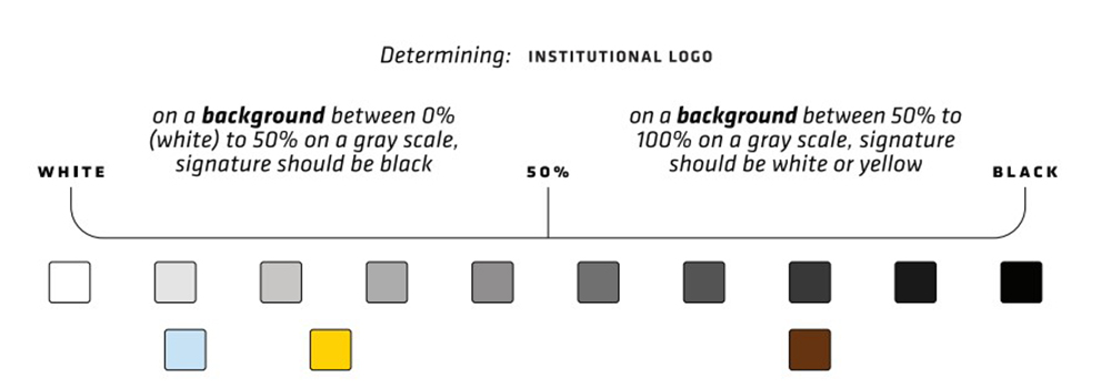
Determine whether a background is light, dark or medium. To do this, a contrast scale is provided for assistance.
It is highly important for maintaining a successful brand that the Wichita State institutional logo be handled correctly when displayed in any form. The examples on this page and the following illustrate unacceptable uses.
- Do not tilt the institutional logo or logotype.
- Do not vertically rotate the institutional logo or logotype.
- Do not combine any other Wichita State logo entities with the institutional logo or logotype. Only exception is traditional WuShock for Athletics, but refer to Shocker Athletics for that standard.
- Do not overlap or overprint any element or logo entity with the institutional logo or logotype.
- Do not distort or stretch any part of the institutional logo or logotype.
- Do not reconfigure, resize or recolor any parts of the institutional logo or logotype.
- Do not apply special effects to or build patterns from the institutional logo or logotype.
- Do not apply an outline or enclose the institutional logo or logotype.

Naming units for colleges, departments, centers and institutes.
The naming policy for the Wichita State organizations is an important element of the design hierarchy. When adhered to correctly, the naming units provide a way for organizations to have a greater sense of identity, increased recognition, and easier application on promotional items and other materials.
With so many organizations in the Wichita State family, it's important to follow these brand policies and recommendations in order to maintain consistency. Proper use of naming units will strengthen the organization's individuality while building overall brand equity in the university.
Learn more about naming unitsFor more information or questions about usage, please contact Strategic Communications at 316-978-3045.