
Good design can lead to better engagement and better understanding.
Before we get too deep into design theory, let’s begin with the very basics. Design can be better discussed when there’s a baseline understanding of the two building blocks of design.
- The Elements of Design
- The Principles of Design
These two building blocks are the foundation to all visual image making, be that traditional art or graphic design. And while the former may be more intuitive in the process the latter is usually very thought out and planned. But what you might not know, or think of immediately, is that the same building blocks used for crafting a pleasing image can also be used when creating material meant to communicate and educate.
Examples include:
- Building and room signage
- PowerPoint presentations
- Infographics and charts
- Illustrations and figures within text
- Step by step instruction
- Recorded lectures
- Recorded VO
Clear Communication
When we communicate concepts using visual material, esp. when those concepts are key points, or complex ideas, understanding how to use design tools can make the difference between information that is clear and effective and information that is unfocused and unproductive.
To begin, let's define those building blocks of design, "elements" and "principles".
Elements of Design
Elements are those things that are used to create design. There are 7 of them. Principles are the guidelines or process of using the elements.
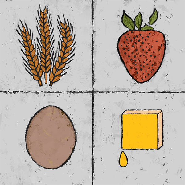
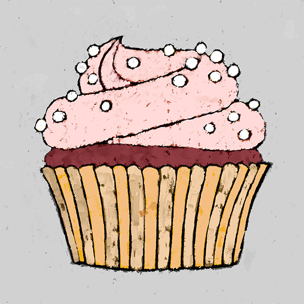
An analogy would be the ingredients used to make a cupcake. However, instead of flour, eggs, butter, so forth, we are working with design elements. For example, color is a design element and is something we can use in combination with something else, like a shape, which is another design element. Each thing is distinct and not dependent upon the other, however, if these two elements are used together there are guidelines, or "recipes", to better assist with mixing the ingredients together to reach specific goals.
The Principles of Design
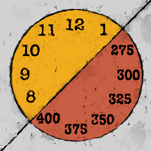
These guidelines are known as The Principles of Design, and there are 12 of them.
Principles are the "how" and the "why" when working with the design. The principles ask us the important questions. How much of this element should I use? Why do I need this element? How do I make this important? How do I make this clearer?
The elements are the "parts" but how we manage those parts determines the success of our end goal.
Like the ingredients for cupcakes, when the elements of your content are working together towards a shared goal, the results are much more palatable and digestible.
And like that cupcake it will probably not be picked off the shelf if it looks haphazardly made or neglected, even if made of the healthiest ingredients.
Better design can help you craft better assets for the classroom.
Make it Work
For instance, knowing how to use "contrast" (a design principle) helps us avoid creating PowerPoint slides where the text is hard to read with certain backgrounds. It also ensures that learners with low vision are better able to read the content.
Applying a few simple design tactics to your content can help in making your content approachable, accessible, and engaging.
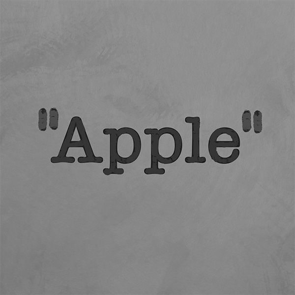
To quote Steve Jobs, co-founder of Apple, Inc., "Design is not just what it looks like and feels like. Design is how it works."
Craft Better Learning
Good design can help you can craft learning content that's:
- more effective in transferring information
- more effective in deepening learner understanding and,
- more engaging to the learner.
Optimize Understanding
"Design is the intermediary between information and understanding."
I would add to Hans Hoffman’s quote that - if we wish for our content to be understood then we need to design our content to optimize understanding.
Besides the elements and principles of design, there are other tools to assist with that goal.
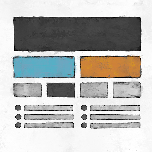
The Grid
One tool is the grid. The grid for design is like a swiss-army knife; it’s multi-faceted, portable, and adaptable to your need. The grid helps with managing all the parts of your learning content co-existing in same location.
Since the grid is such a useful tool that has been around for a very long time, it’s become standard as a means of creating and managing content. Nearly every software program we use to create content is going to be using, not only the grid, but also the design elements and principles.
This is quite handy and timesaving if used properly. The thing is, many of us like to color outside the lines. When we deviate from the intended structure of something like a PowerPoint template, with its established system of hierarchy, proportion, emphasis, space, so forth, then we assume the responsibility of maintaining a design that optimizes understanding and accessibility.

The Right Tool for the Right Job
Let's be honest, many of us like to color outside the lines. I know I do. So, being aware of and using the proper tools, like the user-friendly grid, make our work so much easier. Like my first shop-teacher said almost every class period, "Use the right tool for the right job,".
Lucky for us, most of the tools we use regularly to craft learning content are software apps, and these apps can do much of the heavy lifting for us. For instance, the two primary software bundles you have access to, here at WSU, are Microsoft and Adobe. Each of these software developers design their apps to assist us with keeping our content organized and universally accessible while also providing some assistance with design aesthetics, if needed.
Training & Assets
The last thing I should mention is that WSU not only provides access to the software but also training for those applications, such as those found in Microsoft and Adobe's app suite.
There are also templates created and ready for use that were designed to be accessible and on-brand with Wichita State University.
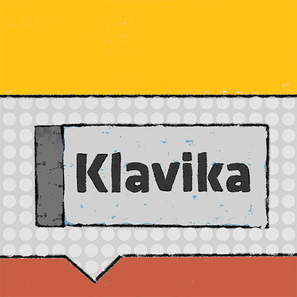
WSU Strategic Communications also provides all the information you might need if you're designing with the WSU brand in mind, including access to the WSU font, Klavika, WSU's primary and secondary color hex codes, and access to WSU logos, just to name a few.
Next Step
There is a lot of information covered in this presentation, and all at a very high-level only. Hopefully, it was concise enough to establish a few orientation markers, so you know where you are, and informative enough to get you where you need to go next.
You can go through each module in order, which they are designed to support, but that’s not required. If you know the topic you need some assistance with, you can go directly to that module.
Learn More
I encourage you to also visit our Additional Resource section below. There you will find curated articles, scholarly journals, and training resources that can help you in your course and content design.
And be sure to attend one of our Academic Resources Conference, where we provide training and engaging conversation three times a year, every January, May, and August.