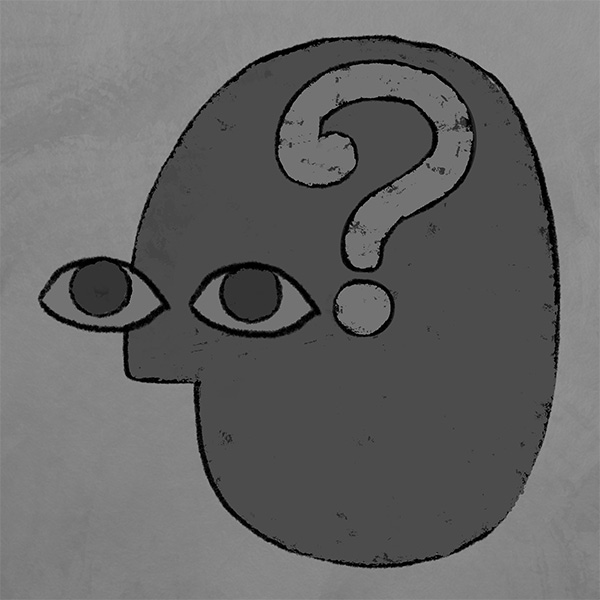
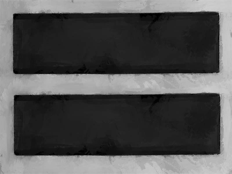

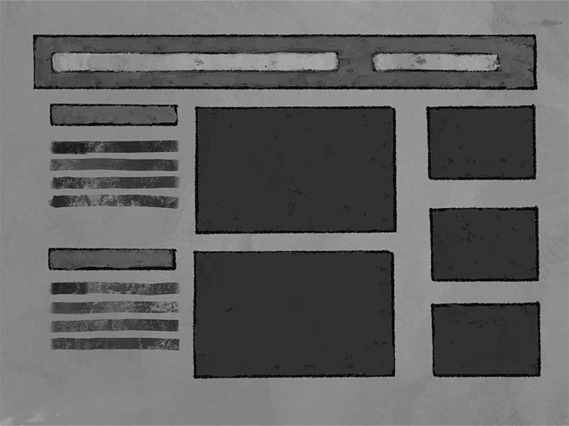
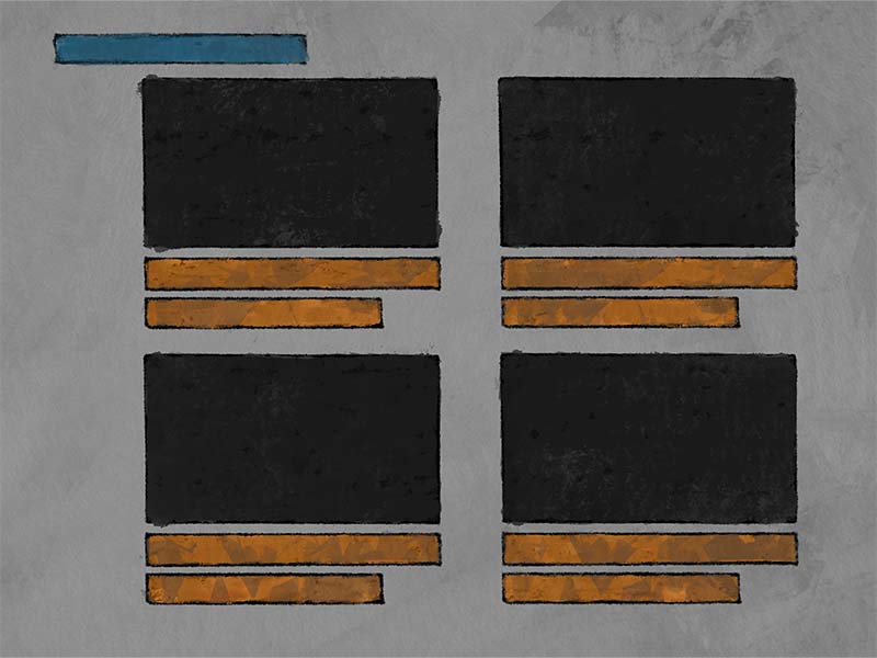
Balance
In visual design balance is the distribution of elements within a composition. The composition can be anything from a painting to a webpage design.
Visual balance is the perception that all elements within a composition are working together in such a way that there appears to be a visual stability between elements in weight and distribution.
A balanced composition, be that in graphic design or in learning content, can provide a sense of authority and confidence due to its visual stability.
Balanced compositions might be safe by nature, but this design principle can be manipulated to create excitement, movement and distress.
There are 3 types of balance:
- Symmetrical
- Asymmetrical
- Discordant
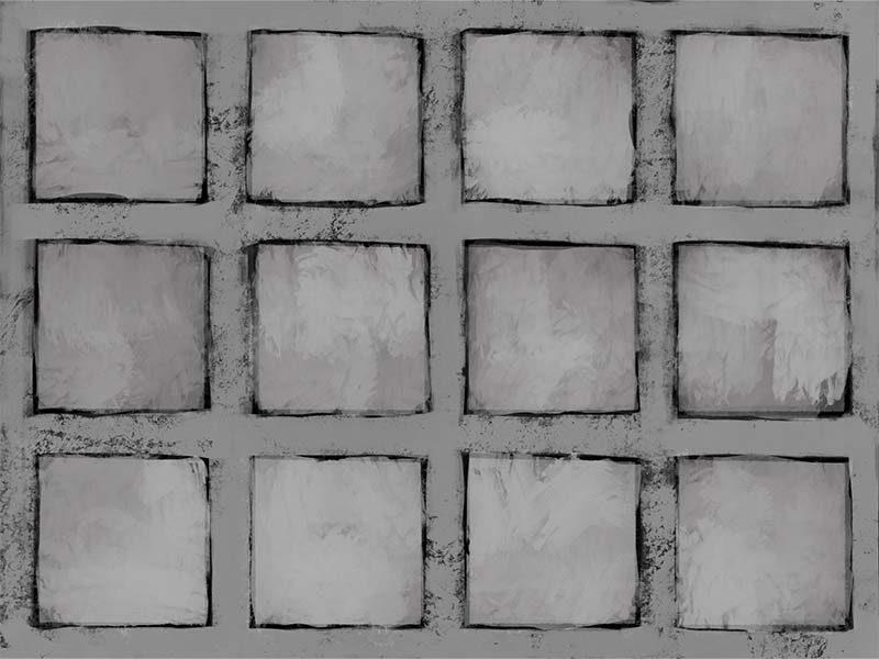
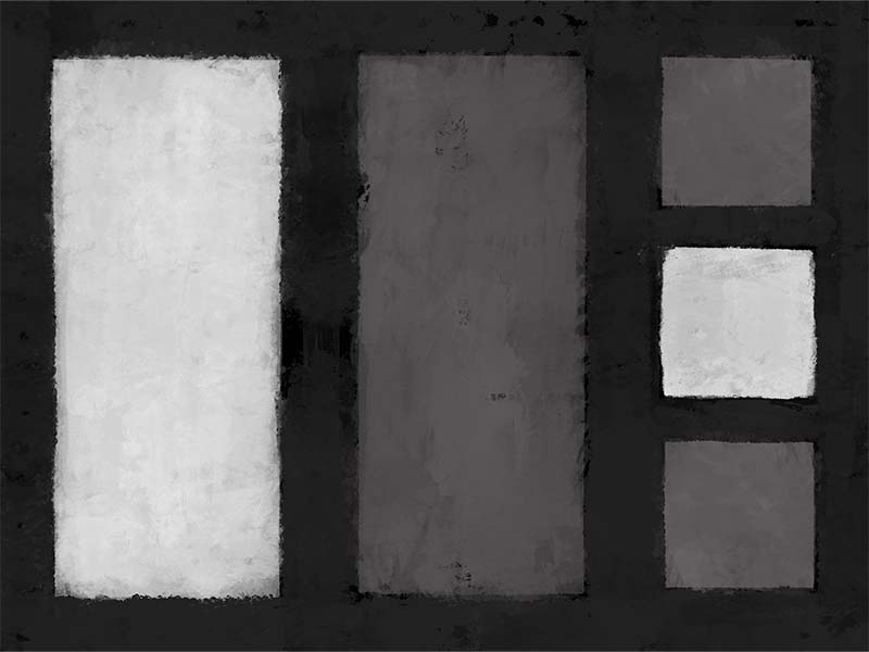
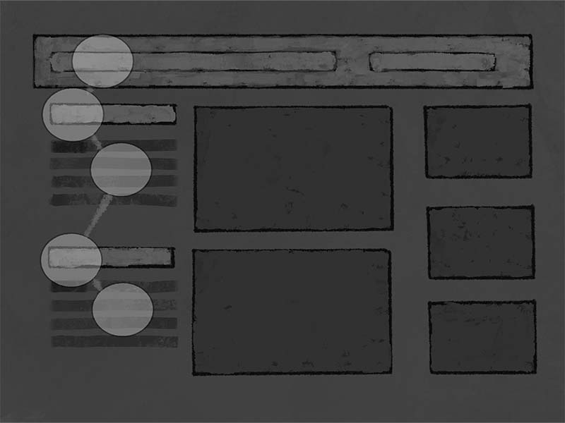
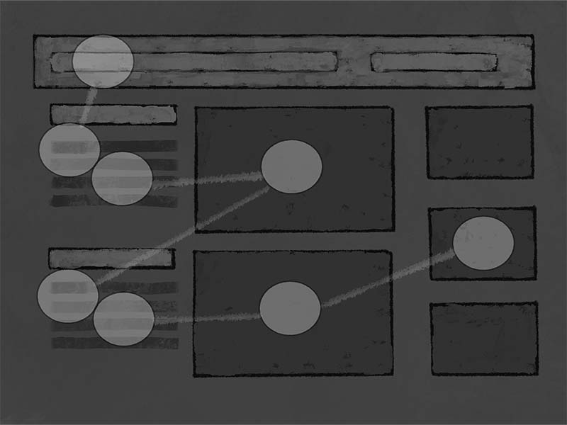
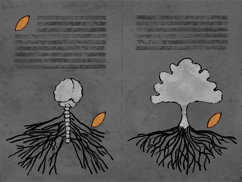
Visual balance, much like physical balance, can be understood as either a “static” or “dynamic”. A symmetrical balance is the most visually stable. An asymmetrical balance can be stable as well as dynamic. A discordant balance is one that interrupts the visual field or path. This interruption can create excitement or discord, depending on use.
Balance is created and modified using the elements & principles of design with a focus on the relationships of each element with the other.
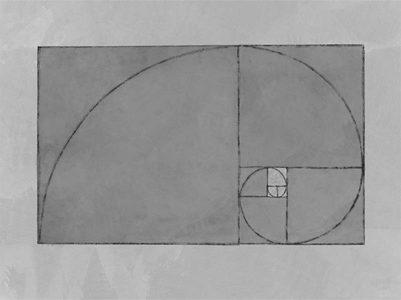
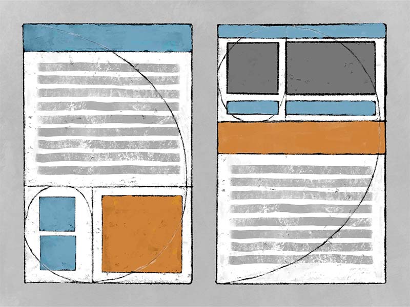
Using a grid is exceptionally useful in achieving balance in your visual design.
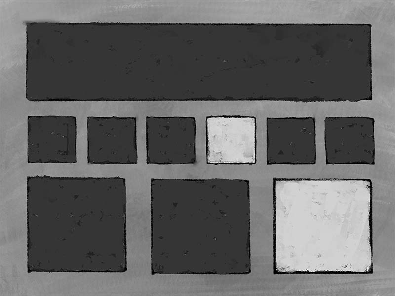
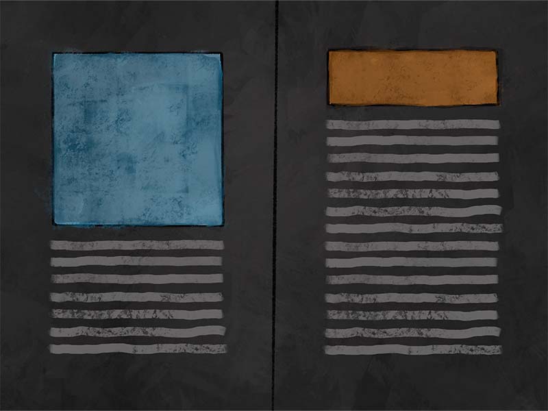
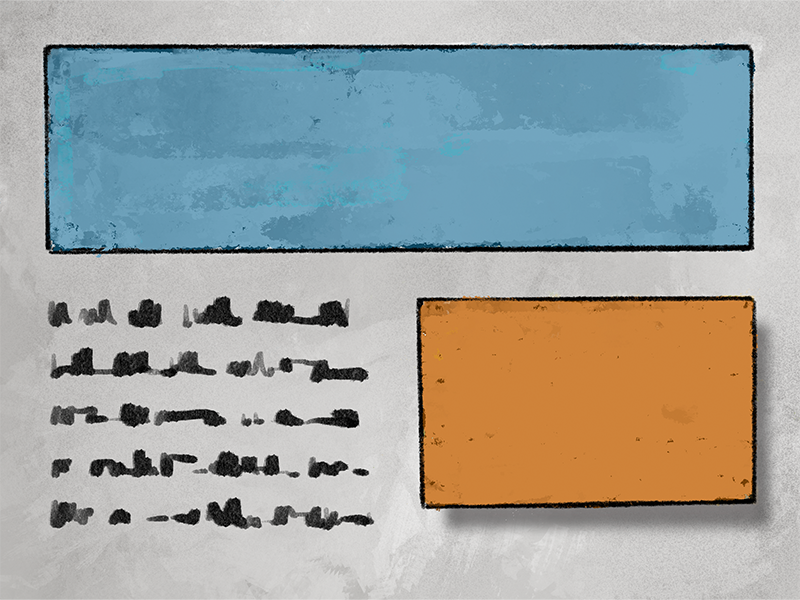
Symmetrical Balance
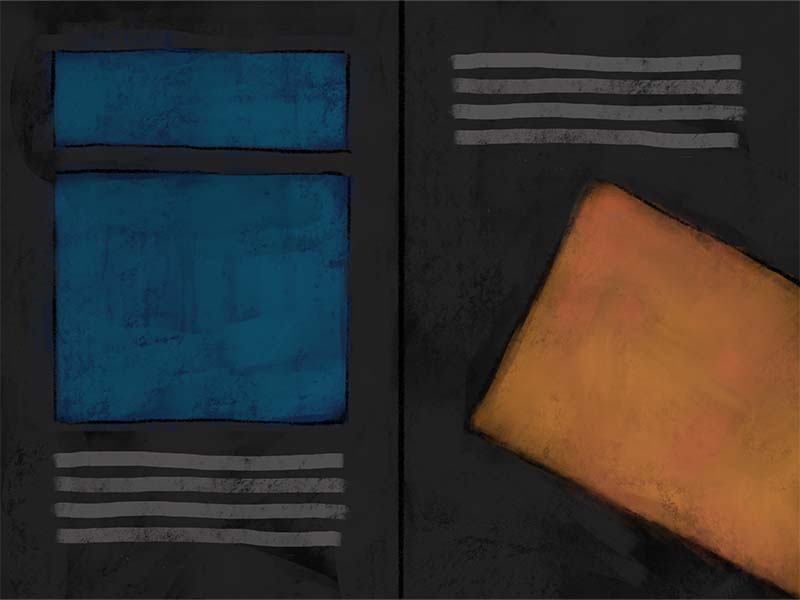
Asymmetical Balance
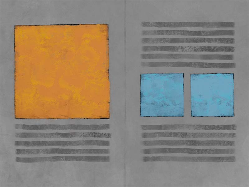
Discordant Balance
Balance is useful for establishing:
- Visual Weight
- Comfort or Discomfort
- A Stable or Dynamic Composition
- A Holistic Experience
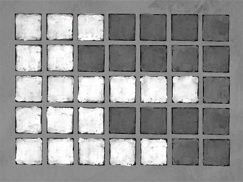
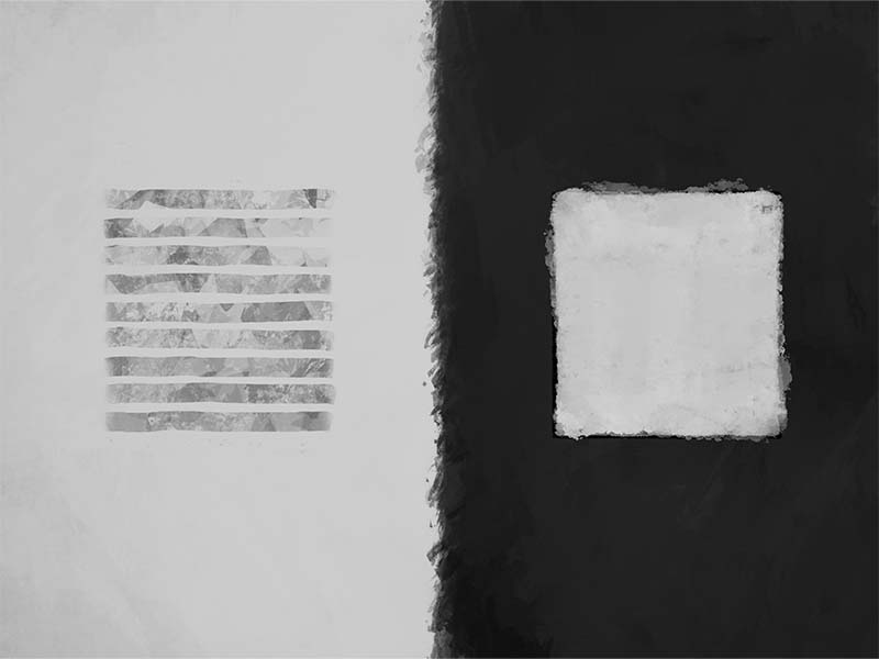
Contrast
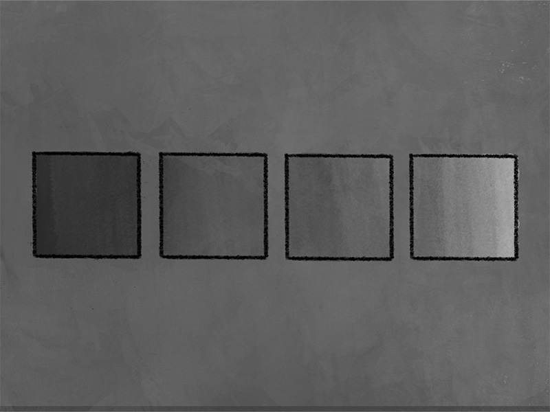
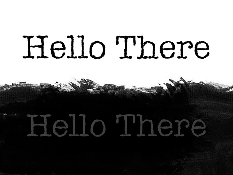
Contrast is, perhaps, the most fundamental of the design principles and perhaps also the most crucial if there is information needing to be transmitted. Surprising, however, I’ve noticed contrast often gets the least amount of attention. Simply recall a PowerPoint presentation you may have sat in where the text was hard to read due to the image behind the text and you will understand. The fault might not have been that of the image, but the contrast between the image and the text.
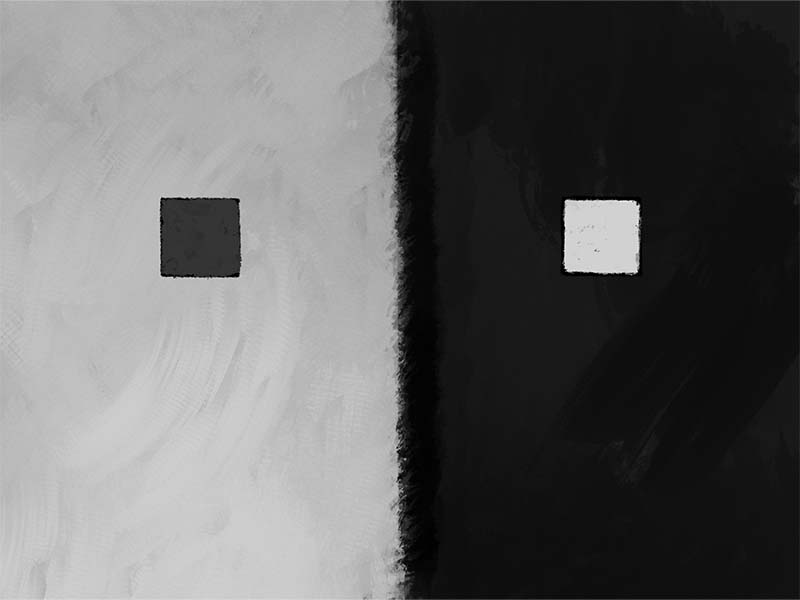
Poor contrast between an object and its environment can lead to a failed objective.
Adequate contrast provides clarity. Clarity of object, clarity of edge, and most importantly, clarity of message.
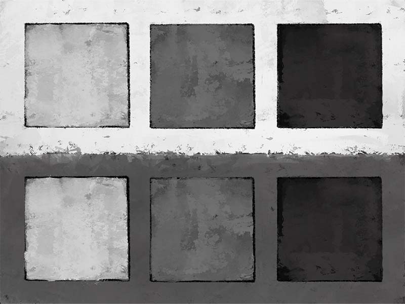
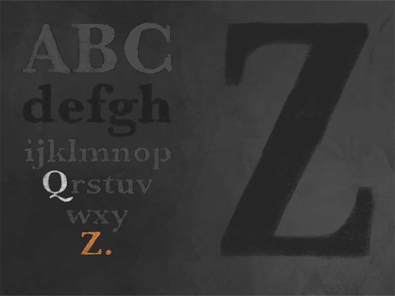
Contrast is created by juxtaposing the elements and principles of design. For instance, black type on a white page creates a very strong contrast, while gray text on a dark page provides little contrast. Other examples of contrast include:
Color Contrast
Shape Contrast
Space Contrast
Contrast is important for:
- Readability/Legibility
- Direction
- Contrast & Comparison
- Establishing Focus
- Establishing Hierarchy
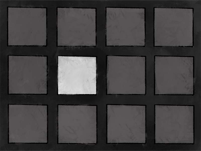
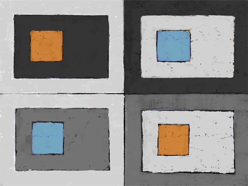
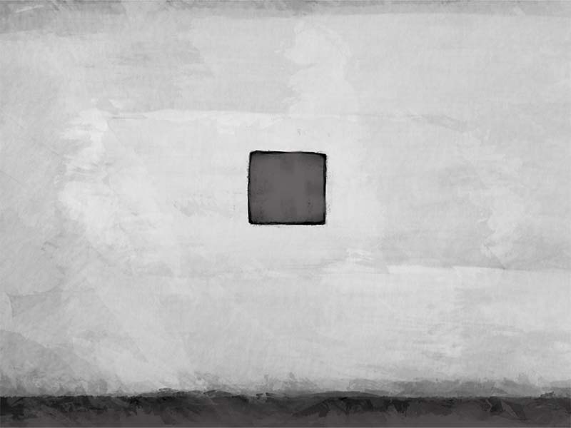
Emphasis
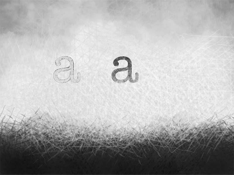
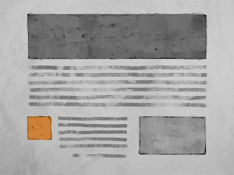
There are times when attention needs to be directed to a specific section within text or to a specific location within an image. Emphasis can be used to pull focus to that important information.
Many of us use emphasis daily. If you point to an object, if you italicize a word or make it bold, if you highlight a paragraph, you are emphasizing the subject in question.
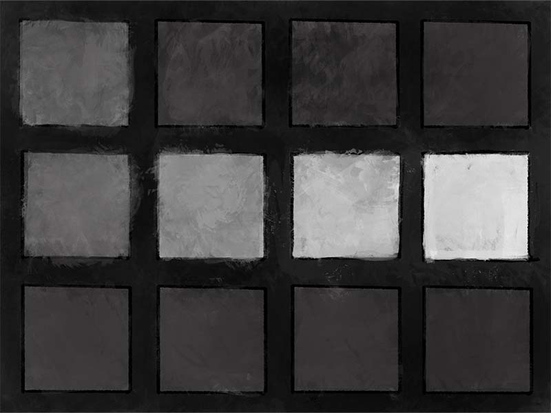
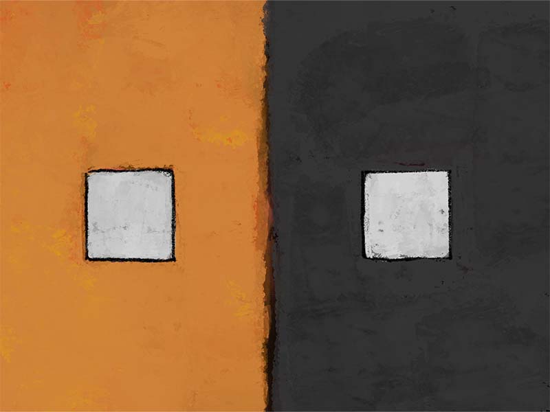
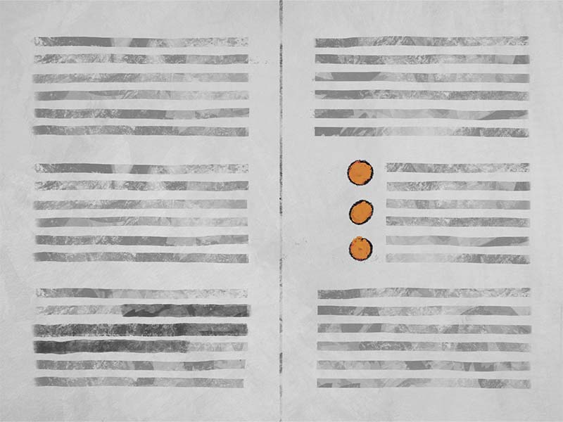
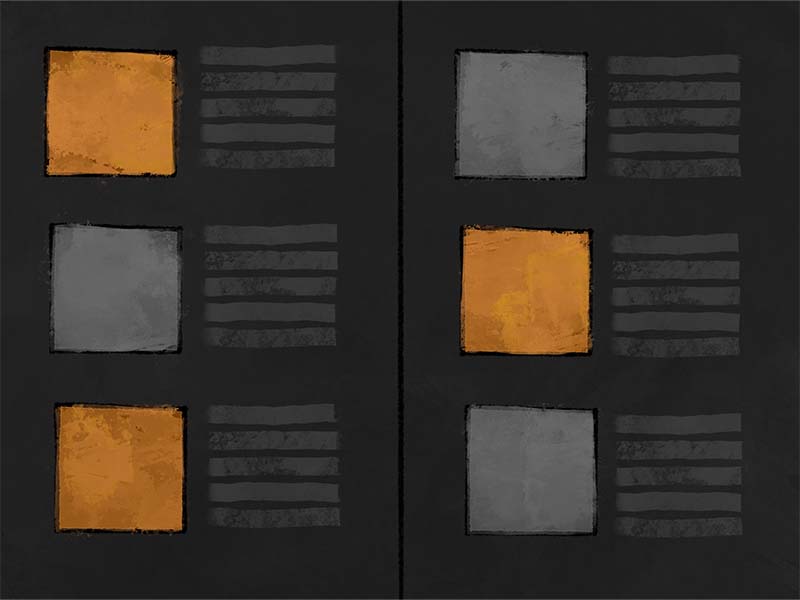
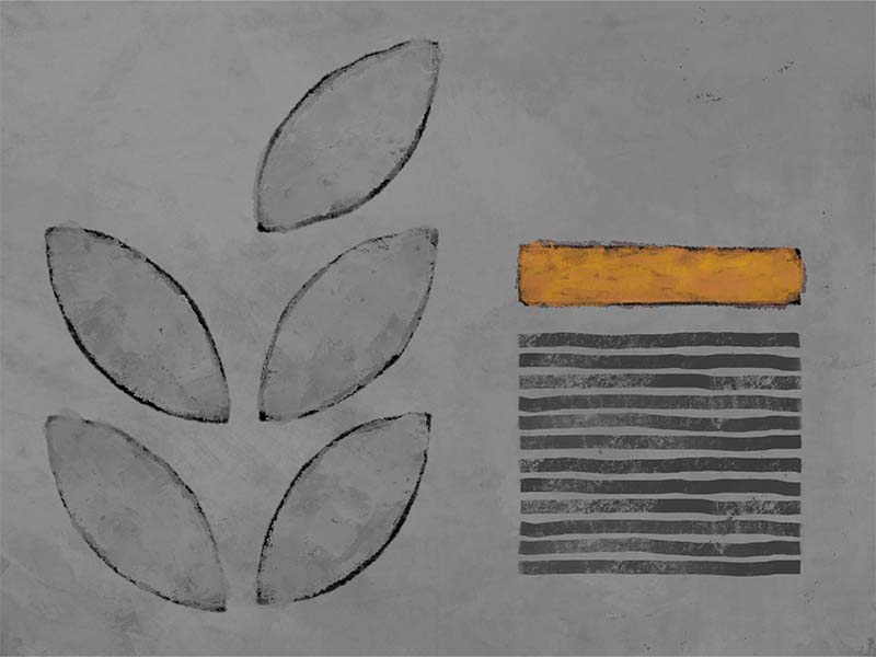
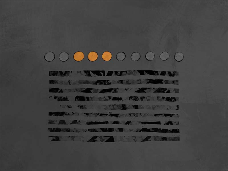
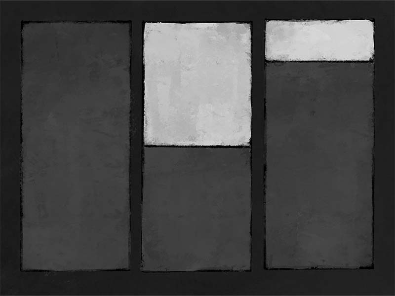
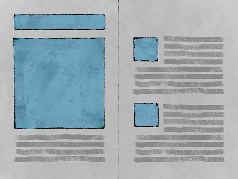
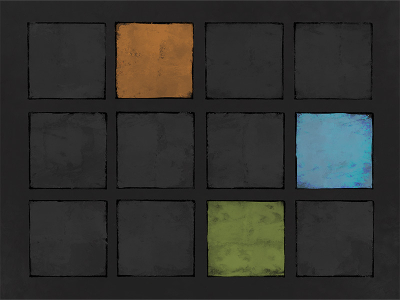
Emphasis, though, doesn’t have to be a blinking light. It can be subtle. For instance, a composition in nearly all gray except for one small orange box illustrates how the orange box becomes an object of interest because it’s different than the other elements in the composition. Not drastically different, clearly, but different enough to pull focus.
Emphasis
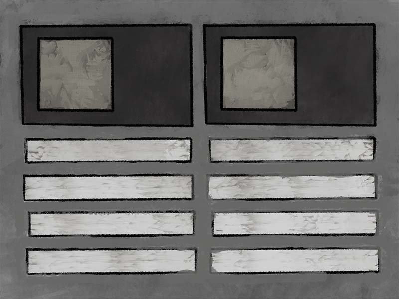
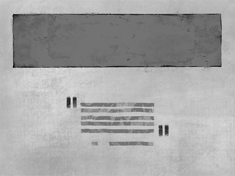
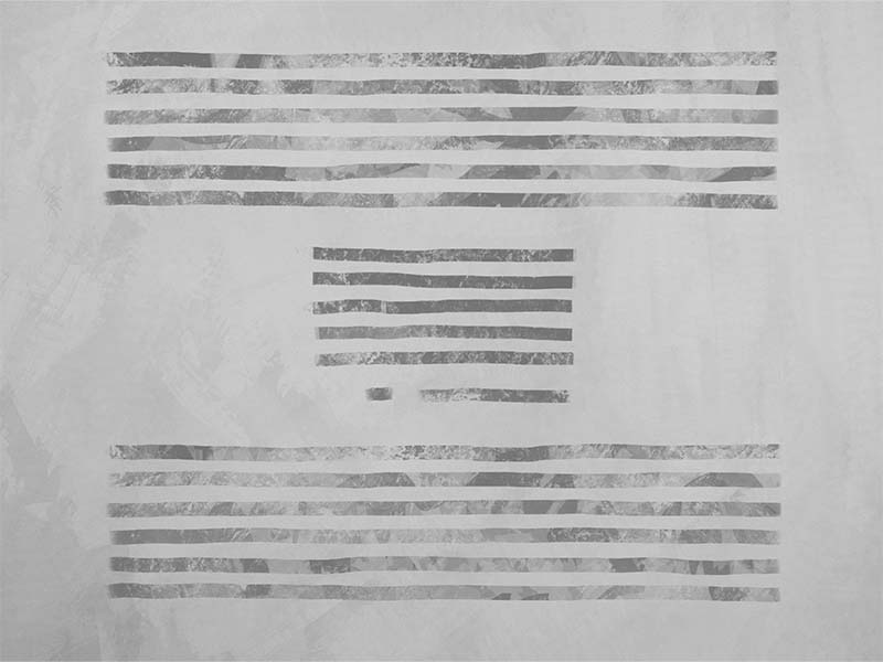
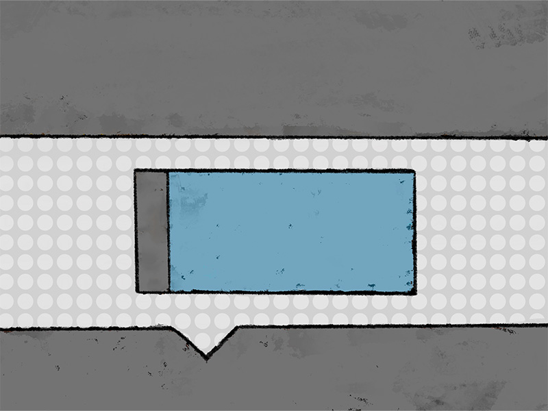
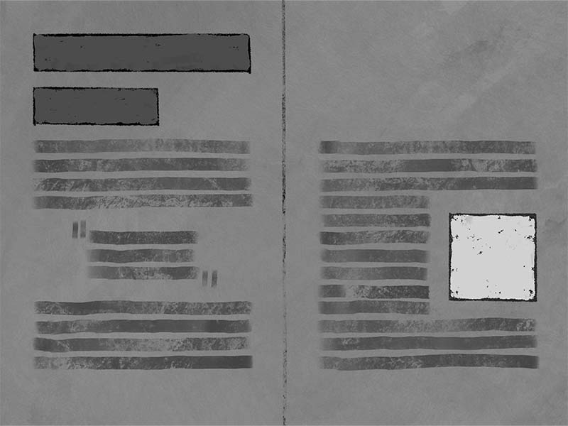
We can see another example of emphasis with the formatting of a quote within a body of text.
The negative space around the quote creates a moment of visual pause, a break in the visual path, because it is so unlike the rest of the page formatting.
This use of space not only creates a focal-point, but also a visual opportunity for the reader to take a breath and reflect.
Emphasis establishes:
- Level of Importance
- Focus
- Attention
- Assists with Hierarchy
- Assists with User Path
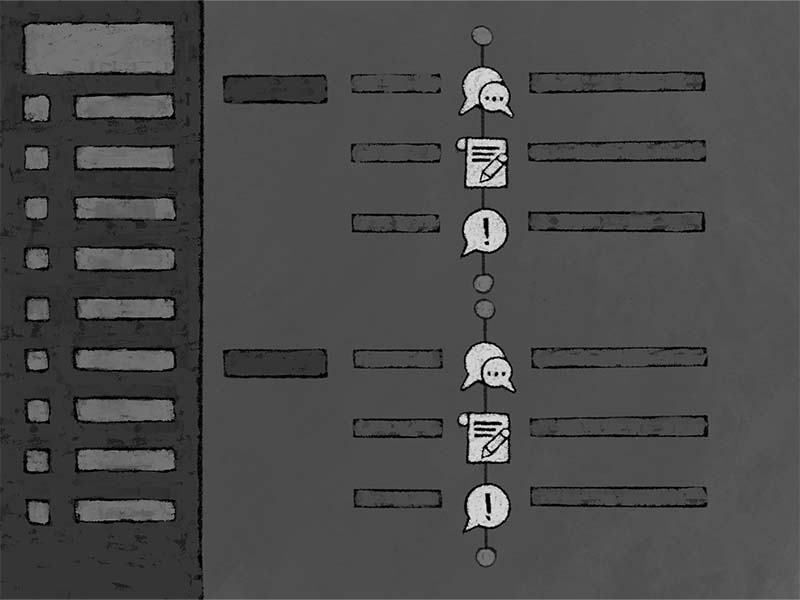
Hierarchy
Hierarchy is a very practical way of establishing an accessible and recognizable order to complex information.
This order also enables those using screen readers to process the information in the correct order, as well as providing the means for scanning the content quickly to find specific sections or topics. This process is much like scanning a title page to get quickly to a specific chapter.
Understanding and using hierarchy enables and supports comprehension and accessibility within learning content and within learning paths.
Hierarchy
Hierarchy establishes:
- Organization of Concept
- Hierarchy of Concept
- Means of Universal Navigation
- Relationships between Concepts
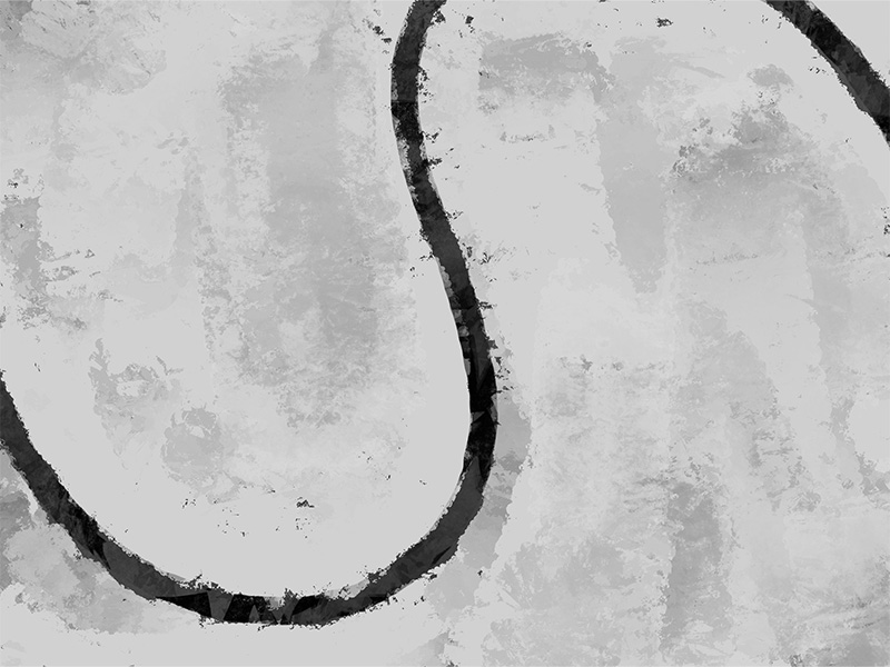
Movement
Unless you want the learner to stand still, a strategy for movement within content, and between content, is needed.
You could rely on common viewing habits, such as reading left to right, top to bottom, however, doing so is assuming that everyone explores and consumes information using the same pattern. There are things you can do to ensure a more universal means to generate proper movement within your content.
Creating a strategy so that the user follows your intended path becomes easier with effective use of movement. Good movement-design encourages the user to stay on target by using visual clues and direction.
For example, in a document where the images appear to be about the same size and weight as that of the text can create a composition that is balanced and stable. A stable composition will encourage slow and steady movement due to the lack of change. Whereas a document with size and weight disparities can create a more dynamic visual movement.
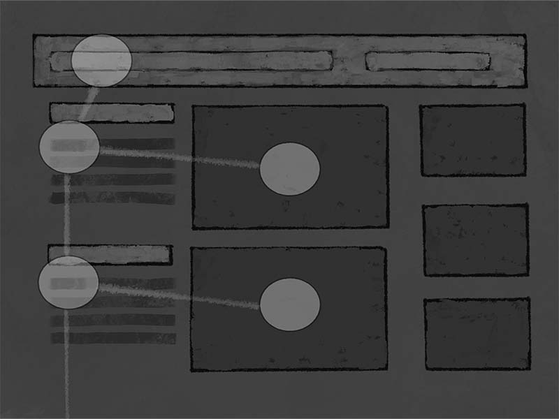
One thing to think about is how most people track visual information. The four most common eye tracking movements are:
- F-Pattern
- Spotted Pattern
- Layer-Cake Pattern
- Commitment Pattern
F-Pattern
This is the most common eye movement when digesting information. The viewer goes from left to right, back and then down, left to right, back and then down.
The visual path looks a bit like the letter “F”.
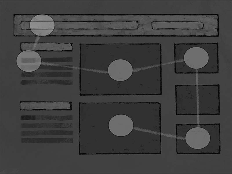
Spotted Pattern
This is most typical if there are ”shiny” or attractive objects dispersed through the composition. The viewer will hop from one shiny thing to the next without any real pattern.
Layer-Cake Pattern
The layer-cake pattern is where the viewer or reader goes from top to bottom, hitting or scanning just the highlights of the content, often. This pattern is much like someone scanning news feed topics before deciding where they want to land and spend some time.
Commitment Pattern
This is the visual pattern we probably all want from our viewers or readers. The commitment pattern is the path the reader takes when they are interested and connected to the subject matter. They take the time to go, methodically, from one element to the next, and in the intended order.
Movement is used to create:
- Interest
- Energy Level
- Direction

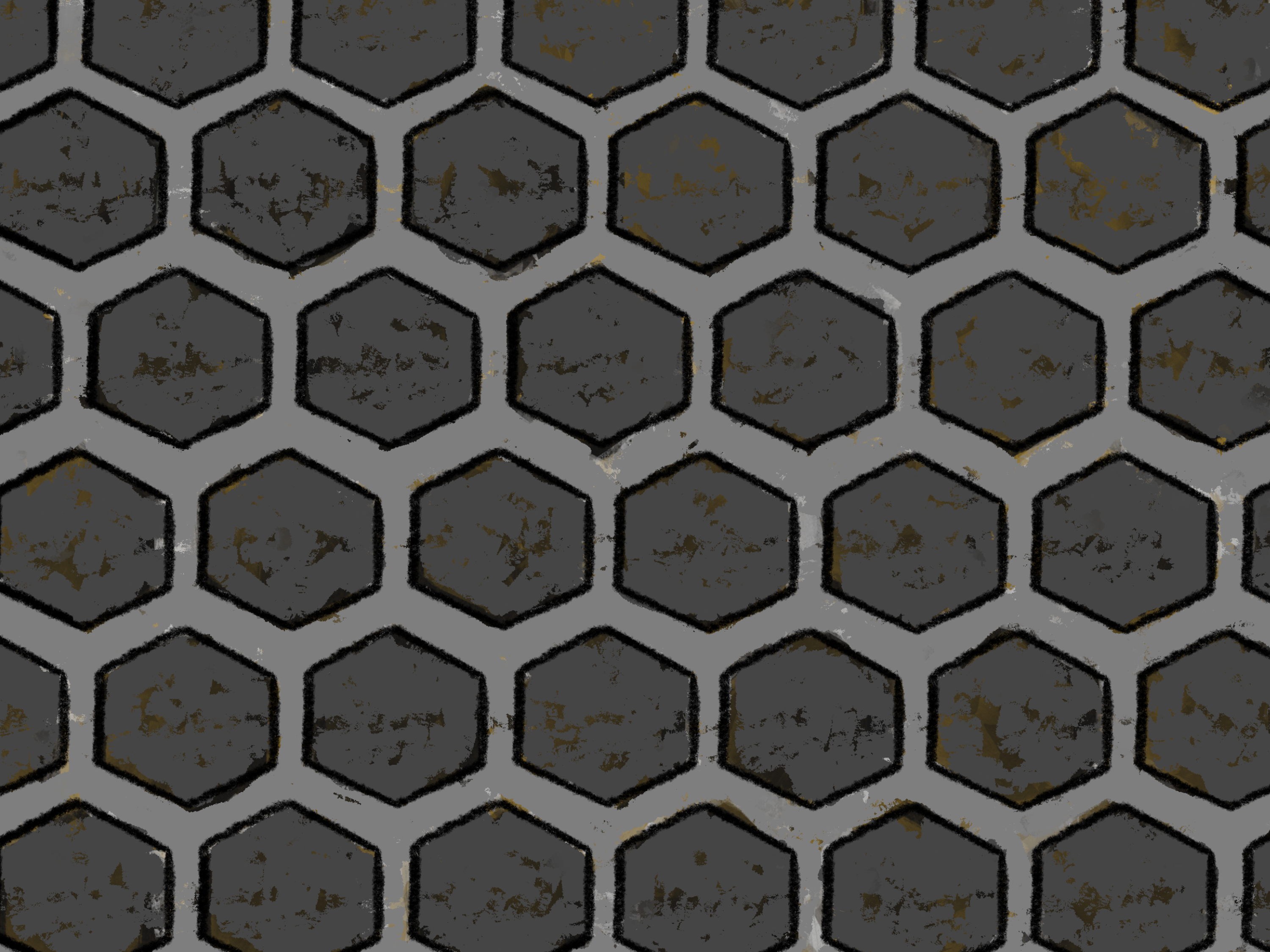
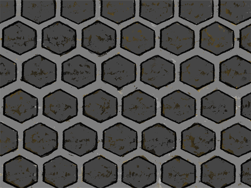
Pattern
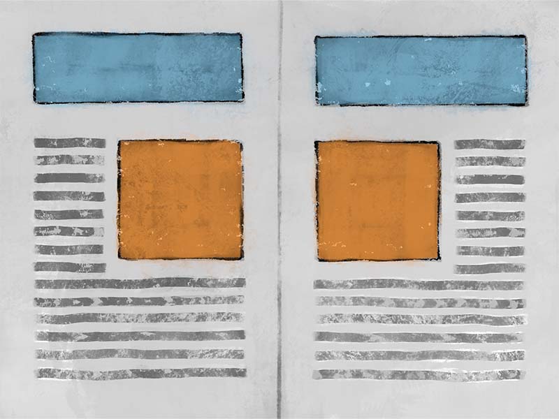
Pattern is the result of one design element, or object, working in unison with other elements to create a repeating pattern.
This pattern can be a visual experience, such as in tile or wallpaper design, but it can also be an activity-based experience, such as learning modules within a course having the same sequential order to the activities and assessments.
The use of pattern can help unify differing elements on a page and assist learners with understanding relationships between ideas.
Pattern can also function as markers for learners to orientate and navigate within a learning path.
Pattern
Pattern is useful for generating:
- Interest
- Unity
- Expectation
- Direction
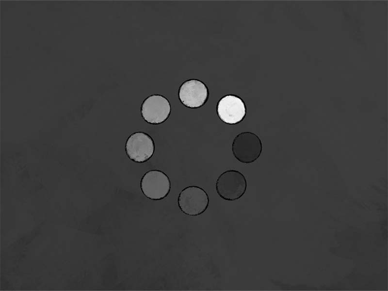
Proportion
Proportion is the Big & Small of it. When you work with proportion you are working with the relative size and scale of objects, or elements, within your composition or document.
Proportion helps establish relationships between objects and between ideas.
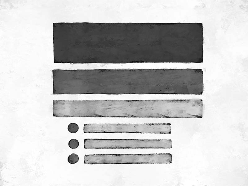
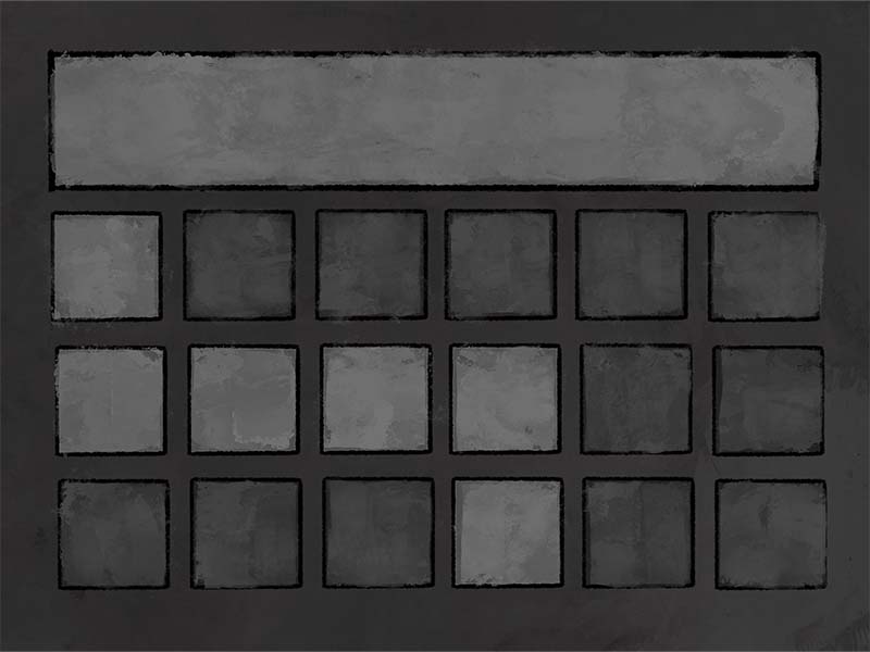
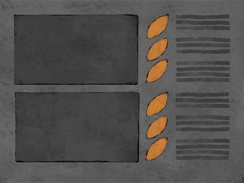
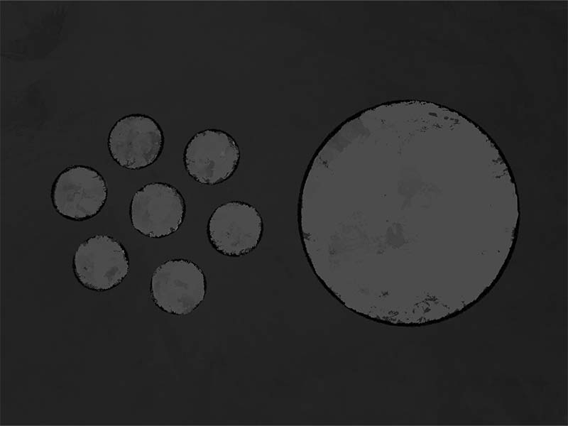
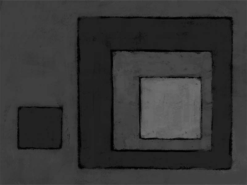
Proportion can be modified and manipulated by the size of objects but also by the number of objects. An example of this would be group of small circles seeming to be proportionate in visual size or weight to a single large circle. Understanding proportion aids in establishing visual harmony.
Proportion can be used to create hierarchy, establish patterns, and create emphasis, for example, but proportion is also used to create the tone of the environment. An environment where all elements share the same relative proportions is an environment more likely to be stable.
While a stable environment might be safe, it might also be boring. Whereas a dynamic environment might be more exciting and better at encouraging exploration, it also can become visually chaotic if not managed.
Proportion can help establish:
- Relationships
- Hierarchy
- Importance
- Energy Level
- Balance
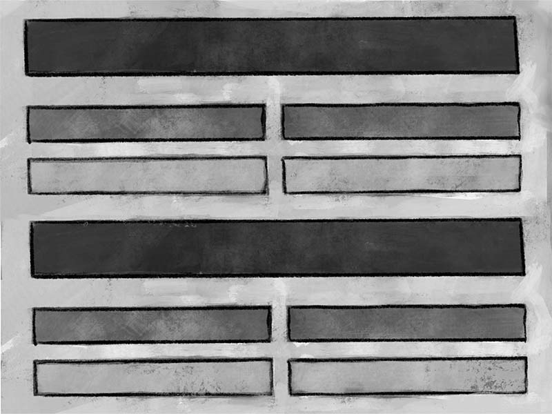
Repetition
Repetition has a reputation; one that is good or bad depending, perhaps, on your experience. While repetition might seem boring, repetition is also needed to master a skill, establish a habit, reinforce concepts & retention, and of course, to create design motifs.
Repetition is important for anchoring a visual design to course content and for establishing a comfortable and familiar learning path through the course content.
For example, designing each of your learning modules to follow the same order of activities and engagement can create a sense of familiarity and a sense of location for the learner, regardless which module they are in.
Repetition is useful for creating a familiar pattern that is easily recognized by the human brain since pattern occurs everywhere in nature. You could say we are hardwired to recognize it and respond to it.
Repetition can be used to create movement within learning, establish the pace of the learning, and provide road markers so the learner knows where they are in the learning path, regardless of module or section.
Use of Repetition can create:
- Meaning
- Relationships
- Pattern
- Expectation
- Familiarity
- Direction
Rhythm
Rhythm isn’t limited to music. Rhythm in design assists with movement and tone within content but also helps with the pace and general experience of the user.
For example, if your learning module is designed to begin with a bang, such as with a high-energy introduction video, and then is followed with reading content that is long and conceptually heavy, and then follow that with a quiz that is timed, and then follow that with reflection and documentation by the learner, you have created a learning rhythm that varies greatly in the energy level expected and experienced by the learner.
Keeping rhythm in mind while creating learning content, or designing your learning path, can assist you in crafting a unified and harmonious user experience.
Ways of creating rhythm are by using pattern, repetition, and space. Types of rhythm include:
- Alternating
- Flowing
- Progressive
- Random
- Regular
Remember, rhythm helps set the tone of the content and the pace of the learning path.
Rhythm can be used to create:
- Movement
- Pace
- Tone
- Harmony of Elements or Objects
Unity/Harmony
Unity is the sense of wholeness, or completeness of all the elements in a design. This can be observed in learning content, as well, when learning assets and learning activities seem to work together to create a unified voice and a holistic learner experience.
Unity is not so much a tool as much as a goal, I think.
Using the appropriate elements and principles of design we can create and maintain a harmonious and cohesive strategy for content creation and for student learning.
Unity is present when the entire design or document feels like a unified team, each element working together towards the same goal.
Achieving unity might seem ambitious or challenging, but it becomes much easier when conscientious of the design principles while crafting your content.
Don’t be frustrated if that sense of Zen doesn’t come quickly, like most things of value it takes time and practice.
Unity provides:
- A Sense of Whole
- A Unified Voice/Message
- Visual Harmony
- Conceptual Harmon
- Stability
Variety
“Variety is the spice of life”, or so the proverb goes.
We know using variety in design can assist in interest and engagement, but it can also assist with learning and retention.
Let’s say our topic is using the night sky for orientation and navigation and our goal is to create a variety of activities that center on our topic. One approach might be, showing the students a video on the movement of the night constellations, followed by reading navigation or journal entries by a historic or contemporary sailor, and then concluding with an assignment where the student documents celestial observations over a month for submission.
All three of those activities center on the same concept but provide fresh opportunities for connective learning and understanding by using variety.
Next to contrast and space, I think this design principle is one of the most important ones, and one that can have the greatest impact in learning if managed properly.
The more ways we can understand and connect a concept, the greater the potential understanding of the concept and of its larger context.
Variety influences:
- Interest Level
- Pace
- Energy Level
- Inspiration & Motivation
- Learning
Space
Space is the space that surrounds an object or element in a design, composition, document or website. This is also known as White Space or Negative Space. Today, this principle is more commonly known as space.
This principle, (and design element), applies to anything that is seen or experienced, such as websites, textbooks and infographics. Space is, in a way, silence.
The purpose of space is to create a comfort zone around the content or subject. This level of comfort can be anywhere from intimate to formal, crowded and bustling to secluded and reflective.
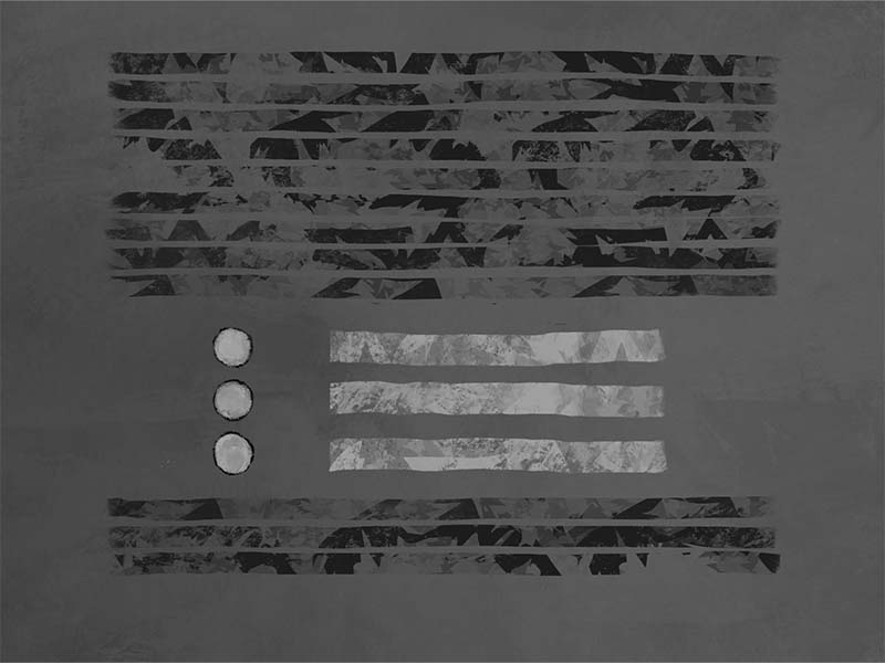
Examples of space can be seen in the formatting of quotes in a body of text. The empty space around the quote isolates the element as something unique and important. The difference in the amount of space around the quote, compared to the normal body of text, creates a moment of pause. Like taking a deep breath and exhaling. This pause can provide a point of reflection for the learner.
Using your space strategically can provide your learner moments of reflection and connection, as well as providing needed breaks in visual consumption.
Space is crucial for:
- Focus
- Readability
- Relationships
- Tone
- Perceived Sound Level
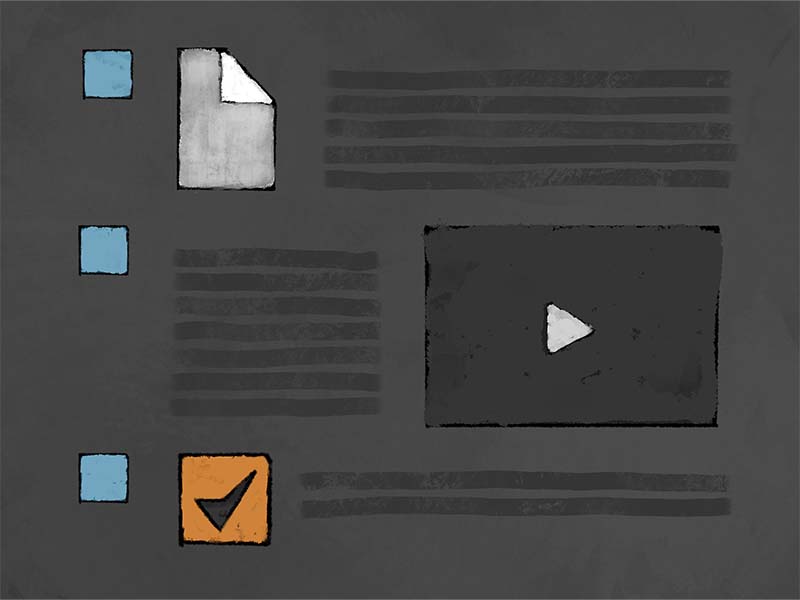
Learn More
If you wish to learn more about better design, I encourage you to visit our Additional Resource section. There you will find curated articles, scholarly journals, and training on design topics that can help you in your course and content design.
And be sure to attend one of our Academic Resources Conference, where we provide training and engaging conversation three times a year, every January, May, and August.