Colors
Color is a critical institutional identifier. Following these guidelines will ensure that WSU’s colors are used consistently. Our colors are Shocker Yellow™ and Black. Shocker Yellow™ is Pantone spot color PMS 116C. For process four-color printing, use the recommended CMYK values. For web and digital platforms, use the recommended HEX value.
| Shocker Yellow™ | Black |
|
PMS 116C (for coated paper) |
PMS black |
The colors shown in this guide are for color reference only. Match to PANTONE® color standards for accuracy. PANTONE® is the property of Pantone Inc.
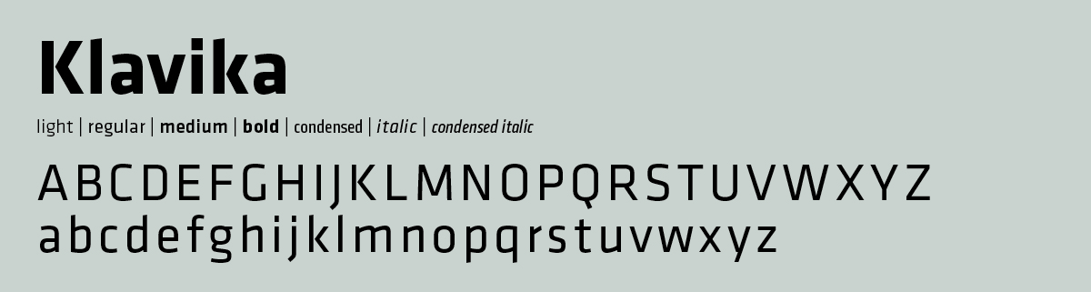
Typography
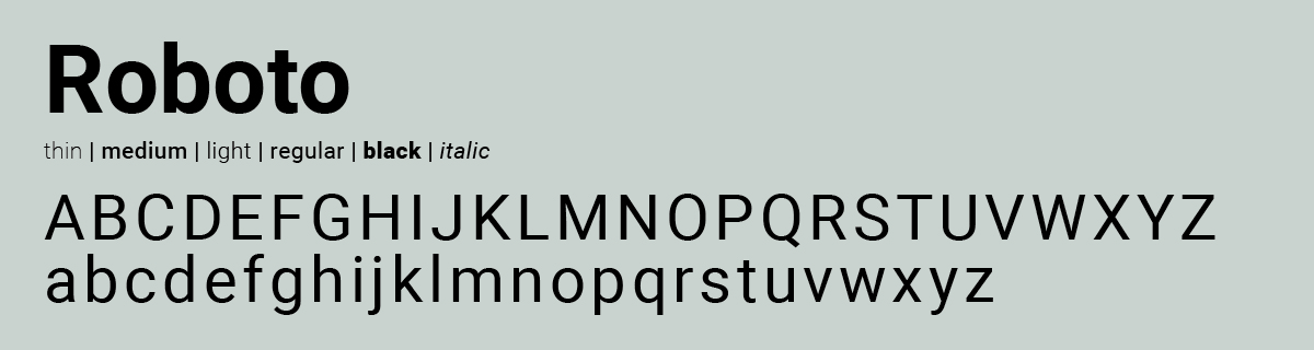
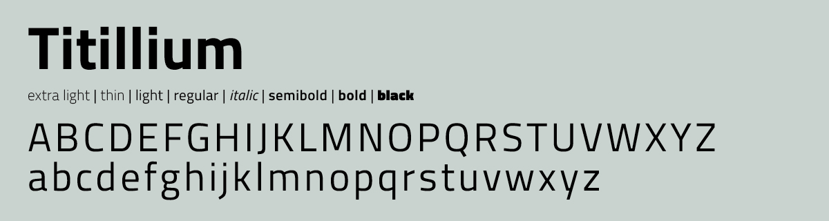
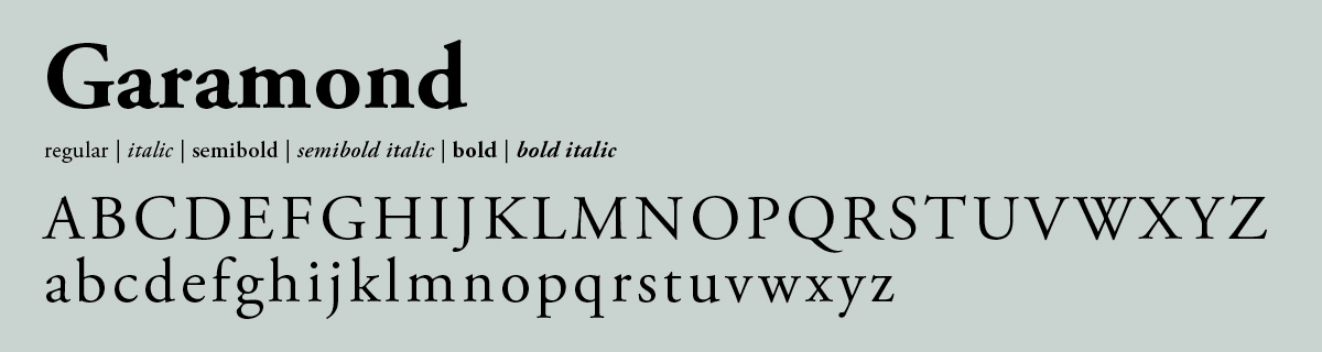
Typography, along with layout, photography and written content, is an important component in successfully communicating our brand. WSU’s primary font is Klavika. Our other main fonts include Garamond, or alternatively, Georgia. Roboto and Titillium are WSU's brand web fonts.
Klavika Font Family is under license by WSU. For a copy of the fonts, contact Strategic Communications.
Primary Font
Web Fonts
Secondary Font
For more information about colors or fonts, consult the WSU's Visual Identity Standards Guide.